Sunday, April 26, 2009

final post.

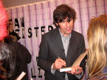
i spent the afternoon at B&N and came across a book called paper engineering and thought i'd share the names of some featured artists. you gotta check them out. their work is so beautifully made and thought out. It's amazing what you can do with paper with a little imagination. Rob Ryan, Katsumi Komagata and of course Stefan Sagmeister.


May 1st is so close! hope to run into you friday but if not, have a great summer break, and good luck! :)

Monday, April 20, 2009

specialty piece: website

here it is:


i want to make it as simple and easy to navigate as possible.
still have far to go but i think i'll call it a day.

Thursday, April 16, 2009

Large ad edited.


okay so i've been trying to work out the problems since tuesday and am very grateful for the constructive criticism i got out of the critique, so thank you :)
as you can see, I got rid of the green bar and added a few more illustrative elements to balance the bottom.
any post-critique comments?

SAVE OUR SEAS!


what do you think?

earth day poster progress.

S.O.S. Save Our Seas
The Greenpeace website has a whole lot of info about environmental issues.
I chose to focus on oceans and how overfishing and trawling are depleting populations and in turn effecting whole ecosystems.

still a work in progress and welcome to suggestions

box progress

I'm pretty excited about this piece because the box design seems so fitting for my client.
i am able to incorporate the house in Vanessa's logo has become part of the box's design.
I am using the logo on several sides as well.

As you can tell, the side and front (pink) go together and the other side and back (light brown) go together.
This is so that when you look at this box at a 3/4 view, it can appear as a 3-D house.
This box will "house" an order of one dozen chocolate chip cookies.

Tuesday, April 14, 2009

fun stuff.


build-a-bear.


i was looking up cool box templates and ran into this.

http://packagingsoftheworld.blogspot.com/2009_03_01_archive.html

Monday, April 13, 2009

personal logo progress

i decided the first logo i designed for myself in grd3000 looked a little too corporate.

here is the newly revised logo i've come up with-(the letters will be resolved.)

Thursday, April 9, 2009

specialty item(s?)

i'm thinking about making a mini- magnetic calendar to serve as another type of "business card"
basically, what I want this specialty item to do is to get Vanessa's name out there.

The calendar serves a promotional purpose as well as- reminding you of all the upcoming holidays for which you need to order a cake, of course!

I figure it'd be handy and practical.

SECOND- is the menu...

Friday, April 3, 2009

The Holidays have never been so sweet.

1. The holidays have never been so sweet.
2. The holidays have never been this sweet.
3. The holidays can't get any sweeter.

oh my. copy is so much harder than i thought. i am open to suggestions and would appreciate feedback very much. :)

Idea #3: combining famous works of art with fabulous cakes.
This one features Degas.

I had to scrap this idea because, while i liked appealing to a different audience/age group, I had to pull too many images from the web to make the concept work. and plus, its kinda hard to put your name on something that isn't completely your own.
so I went back to my sketchbook and whipped this up during class:


The set up and layout is all very tentative. The drawing will be cleaner and more colorful than this.
I am pretending that these ads will be in "family" magazines around the holiday season.
Wednesday, April 1, 2009

what i found while i was stuck.

so many different approaches:

Antonio concert series promotional posters.
Art direction, layout, typography. Illustrations from 1960's Spanish pharmaceutical ads. 2005. Client: Antonio Burciaga (Seattle)

urban typography:

frederiksamuel


typographic nike ad