Thursday, February 26, 2009

simplicity- less is more.

ALL my old ideas have been scrapped!

i'm pretty happy with the results but there's still a lot of editing to be done on each.
Here they are- letterhead, envelope and business card.


The designs look really different printed on off-white paper. I'll scan them in later.

see you all at critique :)

Monday, February 23, 2009

Sunday, February 22, 2009

time out

This weekend, I purposely tried not to think about my stationery too much and it helped. Spending some time away from my designs helped me to de-clutter my overworked pieces some.
here's just the envelope. it's in the beginning stages again and simple as can be. I'm planning to treat the back of the envelope differently than the front because I do want it to be interesting and clean at the same time.


I spent a couple hours at Borders today browsing through books on letterheads and logos and such.
A few things stood out to me that i'd like to share:

if i was able to find a better picture, you'd be able to see all the little details that make these pieces so interesting.
stationery/business card


logo


aw...I took note of many more but am guessing each case study and/or piece isn't available on the web.
hope everyone's stationery sets are coming together-

Monday, February 16, 2009

stationery no.1

no.1

I love the idea of incorporating my old sketches and doodles in my stationery.
I am now in the process of doing so but i must say, it's been a challenge to illustrate and render them in the same 'style' as my logo's image. if only i had drawn out everything in one sitting..':x

as always, feedback, criticisms, advice are all welcome.

Wednesday, February 11, 2009

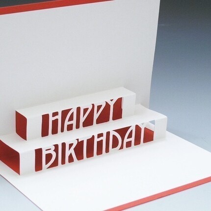
pop-up inspiration

wow, tracychong.

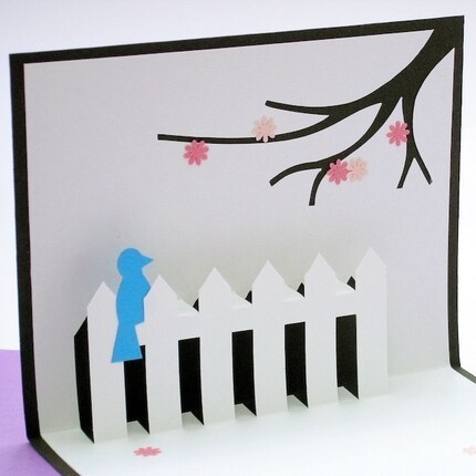
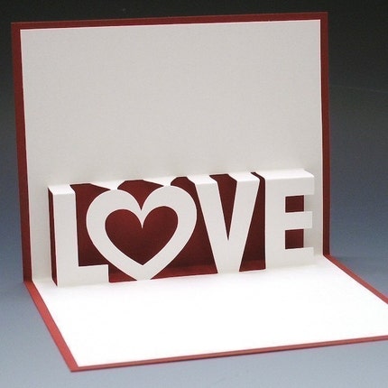
Tracy makes such beautiful, intricately hand crafted popup cards.
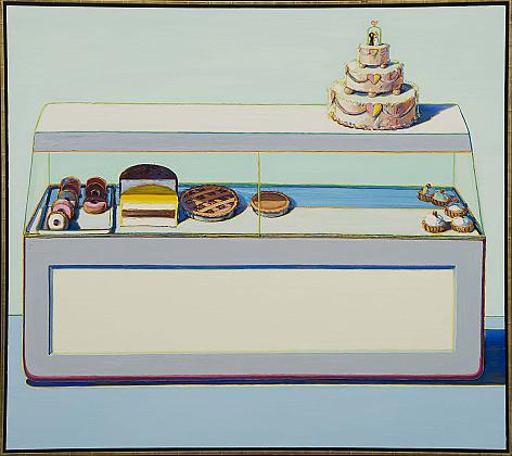
I am planning on experimenting with this Pop-up idea for my business card. I'm very inspired by Wayne Thiebaud's art:


some examples of her work:


Monday, February 2, 2009

:D!

i feel like i'm in a good place now. I thought I liked the square-ish logo from my last post but i've changed my mind again-
i've been sketching every free moment i had this weekend and came upon my logo (which i hope is THE logo) absolutely by accident. I have been looking for an idea or concept that would set Vanessa's apart from your everyday bakery. I wanted to stray as far away from the expected as possible. This design process has been pushing me to think like a designer- I used to want to stick with the very first idea that I liked.
to be honest, i'm a little bit nervous because my logo came about so late in the game- feedback would be really appreciated.
here it is(I did not scan in all my sketches, just the major steps I took to come up with the final)...


see you all in class-

six more.

brainstorming for my final idea.
Baking!:
-Kitchen: order, compartments- shelves and cabinets
-mixing bowls, eggs, flour, wisk, sugar, rolling pin, knife, etc...
-Order: recipes- steps, ingredients


there's more but i think i'm gonna wrap this up in the morning :)

Sunday, February 1, 2009

siiidenote.

:D...
don't worry, bubby's isn't my client for this class
howevver, they really really are wanting to rebrand themselves and asked me to help them out.

hm, at this point in the process...
I love this font but am concerned about its readability. what do you think?
The reason behind the logo's tree is... Bubby's describes their accessories as trendy-
and since trends change each season, i found a tree to be the most appropriate image.
I tried to bring in the boutique aspect by hanging a necklace around the tree's branches.
now that i look at it, it's not as visible as I thought so that'll change :)