Sunday, April 26, 2009

final post.

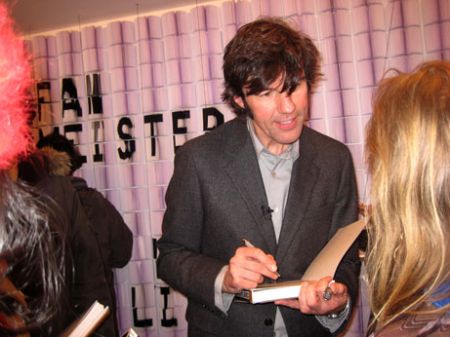
i spent the afternoon at B&N and came across a book called paper engineering and thought i'd share the names of some featured artists. you gotta check them out. their work is so beautifully made and thought out. It's amazing what you can do with paper with a little imagination. Rob Ryan, Katsumi Komagata and of course Stefan Sagmeister.


May 1st is so close! hope to run into you friday but if not, have a great summer break, and good luck! :)

Monday, April 20, 2009

specialty piece: website

here it is:


i want to make it as simple and easy to navigate as possible.
still have far to go but i think i'll call it a day.

Thursday, April 16, 2009

Large ad edited.


okay so i've been trying to work out the problems since tuesday and am very grateful for the constructive criticism i got out of the critique, so thank you :)
as you can see, I got rid of the green bar and added a few more illustrative elements to balance the bottom.
any post-critique comments?

SAVE OUR SEAS!


what do you think?

earth day poster progress.

S.O.S. Save Our Seas
The Greenpeace website has a whole lot of info about environmental issues.
I chose to focus on oceans and how overfishing and trawling are depleting populations and in turn effecting whole ecosystems.

still a work in progress and welcome to suggestions

box progress

I'm pretty excited about this piece because the box design seems so fitting for my client.
i am able to incorporate the house in Vanessa's logo has become part of the box's design.
I am using the logo on several sides as well.

As you can tell, the side and front (pink) go together and the other side and back (light brown) go together.
This is so that when you look at this box at a 3/4 view, it can appear as a 3-D house.
This box will "house" an order of one dozen chocolate chip cookies.

Tuesday, April 14, 2009

fun stuff.


build-a-bear.


i was looking up cool box templates and ran into this.

http://packagingsoftheworld.blogspot.com/2009_03_01_archive.html

Monday, April 13, 2009

personal logo progress

i decided the first logo i designed for myself in grd3000 looked a little too corporate.

here is the newly revised logo i've come up with-(the letters will be resolved.)

Thursday, April 9, 2009

specialty item(s?)

i'm thinking about making a mini- magnetic calendar to serve as another type of "business card"
basically, what I want this specialty item to do is to get Vanessa's name out there.

The calendar serves a promotional purpose as well as- reminding you of all the upcoming holidays for which you need to order a cake, of course!

I figure it'd be handy and practical.

SECOND- is the menu...

Friday, April 3, 2009

The Holidays have never been so sweet.

1. The holidays have never been so sweet.
2. The holidays have never been this sweet.
3. The holidays can't get any sweeter.

oh my. copy is so much harder than i thought. i am open to suggestions and would appreciate feedback very much. :)

Idea #3: combining famous works of art with fabulous cakes.
This one features Degas.

I had to scrap this idea because, while i liked appealing to a different audience/age group, I had to pull too many images from the web to make the concept work. and plus, its kinda hard to put your name on something that isn't completely your own.
so I went back to my sketchbook and whipped this up during class:


The set up and layout is all very tentative. The drawing will be cleaner and more colorful than this.
I am pretending that these ads will be in "family" magazines around the holiday season.

Wednesday, April 1, 2009

what i found while i was stuck.

so many different approaches:

Antonio concert series promotional posters.
Art direction, layout, typography. Illustrations from 1960's Spanish pharmaceutical ads. 2005. Client: Antonio Burciaga (Seattle)

urban typography:

frederiksamuel


typographic nike ad

Monday, March 30, 2009

cool ads


this is one of eleven great examples of ads. you should check the others out.

Sunday, March 29, 2009

depth?


hm, these are not coming out exactly how I planned but I'm working with cut-outs like this for my ads.
the quality of these houses is pretty bad so i plan on rescanning and editing at school tomorrow
but!-
more than better scans, what I really need is feedback. the biggest question is...does layering the cut-outs like this show depth?
if not, i'm open to suggestions :)

+++++++++ my 5x5 idea: i'm pretending that these ads will be printed in magazines just before christmastime- vanessa's busy season. (these houses will look more festive for the real ad)
possible tagline: Mmmm...erry Christmas!

Thursday, March 26, 2009

other

This is something i whipped up really quickly for Rodem Choir of Marietta's concert, wish i had more time to work on it before I got it printed. :(


in case you're interested:

ShopVisible LLC was founded in 2006 by a group of entrepreneur revolutionaries whose perfect mix of new technology expertise and online marketing know-how is changing the way Web retailers do business. Driving heightened visibility and success for every new client, ShopVisible has become the sales, marketing and IT team MVP for smart online business owners across the country.

We're currently offering a hands-on internship opportunity to a top-notch graphic designer with a SHARP sense of style. This resume-building experience will include creating business-ready print collateral, including:

* marketing brochures
* ad slicks
* business cards
* banners
* powerpoint presentations
* diagrams and charts

Please, do NOT apply unless you are experienced with

* Illustrator,
* PhotoShop, and
* InDesign

Students with experience using flash, css, and/or html will have an added edge, and e-commerce or web usability experience is also a plus.

This opportunity is a PAID 20-40 hr/wk summer position. The hired intern will work in a fun environment on-site with the ShopVisible staff, an enthusiastic and well-connected crew that will be helpful in future networking.

Please send your resumes to pchen@hobnobjobs.com for initial screening and have your portfolios ready. We look forward to meeting you!

Tuesday, March 24, 2009

ad possibilities

this is what i've come up with.
i plan to draw in scenes in the "photographs."

Sunday, March 22, 2009

toy design


a long time ago, i was seriously considering majoring in Toy Design.
did you know that there are some schools where Toy Design is a major in and of itself, pretty cool huh?


A toy designer is a very creative individual that is able to develop a completely new type of toy, game or children's activity, and then bring it to life. This means drawing, sketching or making a computer model of the concept, deciding how to make each detail, and then creating a prototype of the toy. Involved in this process are computer skills, possibility mechanical skills, creativity and originality and an ability to relate to the interests of children. Most toy designers spend a lot of time watching children play or thinking about modifications to existing games or toys that could be used for completely new projects.
----
Most toy designers have a background in graphic arts or design as well as a good working knowledge of computers. Since most toys are now first generated through various computer programs before they are actually physically made by having the ability to do this themselves the toy designer can speed up the development process. A toy designer must also market his or her new toy to a toy manufacturer, unless they are already working on a specific project for the manufacturer. To market the toy the designer must be able to do a cost analysis and have preliminary information on the cost of production and the expected retail cost.
(from jobprofiles.org)

A degree in Graphic Design can seriously take you far because it's applications are endless.
its been hitting me more and more that just about everything we see and walk by is Design.
i can't even walk by signage until i've taken a good look at it, ha

but anyway, here are some examples i found online of some popular vinyl collectible toys you can find at stores like metropark, (sometimes) urban outfitters, and certain toy stores. :)


Tokidoki is pretty amazing at creating patterns and scenes with all their different characters (maybe you've seen them on LeSportsac Purses?)


OH! and if you haven't been to the HIGH to see the terra cotta army, its pretty amazing but it's leaving soon!
It's only $5 for students (with student ID).
Wednesday, March 18, 2009

red velvet cake

i'm not a baker by any means but i thought i'd give it a try just once to see if i could get a few good photos to work with :)


now back to work on the ads illustrations

Thursday, March 12, 2009

the beginnings of an ad

I've decided to go with illustrations!
My goal is to feature Vanessa's different dessert selections in snapshots of family/holiday memories.
The first sketch: i haven't gotten around to drawing the bodies yet.. ':)


Some inspiration...


i absolutely love this style. The illustrations are in the same style of the bakery's logo. I'm planning on going in this direction. http://www.brulee.ca/desserts/more_than_desserts


Claudine Hellmuth


http://www.daisyandwaverly.com/AtDino-ChocStrawberryCakeMontage.jpg
I think it would be interesting to incorporate the cake-making process in an ad.

RIDICULOUS cakes- check it out > http://sugarcraft-india.blogspot.com

I guess, that's it for now...
have a good weekend :)

Stationery Set Progress- the final stretch!

Earlier this week:

After some finishing touches, here is the result:

-The striped background will be making another appearance in my ads.
-The business card still remains a pop-up. I've got to scan in my illustrations asap!
-Any suggestions for the envelope color? I'm thinking about letting it be the paper's off-white color.

Wednesday, March 11, 2009

or maybe this one


Balcony View
Charcoal
18x24

Friday, March 6, 2009

possible entry

Arthur Rackham's Fair Helena (1909)
from his series of illustrations for A Midsummer Night's Dream

Possible entry #1 is my rendition of Rackham's Fair Helena

Pastel, Charcoal, Ink Wash

Thursday, February 26, 2009

simplicity- less is more.

ALL my old ideas have been scrapped!

i'm pretty happy with the results but there's still a lot of editing to be done on each.
Here they are- letterhead, envelope and business card.


The designs look really different printed on off-white paper. I'll scan them in later.

see you all at critique :)

Monday, February 23, 2009

Sunday, February 22, 2009

time out

This weekend, I purposely tried not to think about my stationery too much and it helped. Spending some time away from my designs helped me to de-clutter my overworked pieces some.
here's just the envelope. it's in the beginning stages again and simple as can be. I'm planning to treat the back of the envelope differently than the front because I do want it to be interesting and clean at the same time.


I spent a couple hours at Borders today browsing through books on letterheads and logos and such.
A few things stood out to me that i'd like to share:

if i was able to find a better picture, you'd be able to see all the little details that make these pieces so interesting.
stationery/business card


logo


aw...I took note of many more but am guessing each case study and/or piece isn't available on the web.
hope everyone's stationery sets are coming together-

Monday, February 16, 2009

stationery no.1

no.1

I love the idea of incorporating my old sketches and doodles in my stationery.
I am now in the process of doing so but i must say, it's been a challenge to illustrate and render them in the same 'style' as my logo's image. if only i had drawn out everything in one sitting..':x

as always, feedback, criticisms, advice are all welcome.