Friday, January 30, 2009
pleth⋅o⋅ra (n)
i am not completely sold on any ONE logo yet...so i've got a lot to think about this weekend.
i'd love to hear..
of all the designs and/or sketches i've done so far- which one (for Vanessa's Holiday Sweets) stood out to you most?
good luck everyone!
Thursday, January 29, 2009
here we go..
while i was set on using a sign as VHS's logo earlier this week, I decided that the shape was not an easy one to work with. It's position on any one of these pieces, like business cards or stationary, would be limited to the left top. I am looking for a logo that is more flexible...
color versions to be posted.
Tuesday, January 27, 2009
its starting to come together!
I talked to my client over the weekend, showed her my designs (^) and gathered more info about what she does and how it all came to be:
-Her Holiday Sweets business started in 1999. To make some extra money over the holiday season, she baked cakes and pies for coworkers and friends. Before she knew it, they were asking her for recipes and word about her desserts. :)
-She is busiest from around Thanksgiving to New Years.
-Her business card is mainly Red, White, and Green.
-As far as competition goes, she says there are not many bakeries around where she lives. And so, i have been googling bakery logos online to see what is already out there- what works and what doesn't.
-She likes the last logo on the left (the sign) best. Only we decided a cake would represent her business better than the pie.
I am going to try drawing the logo and scanning it in. Color-wise, I think i will stick to just red and white and replace green for brown.
Wednesday, January 21, 2009
option 2: PARK Chiropractic
def: Chiropractic- A health care profession concerned with the diagnosis, treatment and prevention of disorders of the neuromusculoskeletal system and the effects of these disorders on general health. There is an emphasis on manual techniques, including joint adjustment and/or manipulation with a particular focus on subluxations.
(The WHO definition, World Health Organization, Guidelines on Chiropractic, 2005)
(I have PARK written in both English and Korean because his current sign includes both):
which one is most effective/memorable?
sweet.
here it is!-oh, I meant to flip the word "SWEETS" on the first logo to make it read normally but forgot.
Some feedback I got in class:
*it is kind of reminiscent of Krispy Kreme's Hot Sign.
*the colors work well together
some more logos:
(do you see the "V" under the cake logo?)
& here is a repost of my first logo for Vanessa's Holiday Sweets:
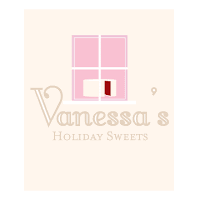
feedback is always welcome, please leave criticisms &/or suggestions, thanks! :)
Monday, January 19, 2009
option 1: Vanessa's Holiday Sweets
Tuesday, January 13, 2009
the search is finally over.
While I am excited about Bubby's Boutique, the imagery that comes to mind is nothing more than predictable at the moment. I think i'll explore it on the side and work with Vanessa's Holiday Sweets (a new choice of mine) for the project instead. The name in itself is already not the typical So&So's Bakery and gives me a little more to work with. :)
What makes Vanessa's Holiday Sweets so different from its competitors is that Vanessa works straight from her home--making her cakes as homemade as they come. :D She makes the most amazing cakes and pies but the boxes in which they come in- along with the quality of her current logo and menus- do not do her justice. I have already been able to come up with some good ideas for specialty pieces so far...
So I'm thinking this one's the one. the search is finally over :)
++++side note: just wanted to share of my favorites of Jason Mraz++
Check this out: http://www.bspcn.com/2009/01/03/20-weird-logos-that-work-and-why-they-do/
& Have a great long weekend!
====================================
Possible logo:
Monday, January 12, 2009
Bubby's Boutique
"Distinguished and affordable women's accessories: jewelry, Pashminas, bags, casual wear, hair accessories, [& other] giftables."
Coming across Bubby's Boutique was actually a complete accident.
I must have driven around for about two hours before pulling into this shopping center.
I guess the saying's true- the best is saved for last.
The boutique has no official logo as of yet and fonts vary from store sign to business card to price tags.
I was really fortunate to meet a very open-minded store owner who got really excited upon hearing about this semester-long rebranding project.
Here are some pictures i took in the shop:
Here are some computer renderings of my sketches:
This "client-search/research experience" had a bit of a rocky start but the pieces are starting to come together.
good luck everyone, can't wait to hear how it's been going for you all. :)
Sunday, January 11, 2009
MY TOP 4
1) Six Beans
2) Bubby's Boutique
3) Park Chiropractic
4) Joy Upholstery
[More details and sketches to be posted.]
Saturday, January 10, 2009
helloo.
Personal Logo:
Eco-friendly Package Re-Design for Speedo's Blow-up Arm Bands:
I decided to repackage arm floaties. Although they do not require a case or fancy package, because they are made to ensure children's safety at the pool, I felt that my new package would need to leave a big impression on consumers. The idea behind this eco-friendly (paper) package redesign was to appeal to both children and, of course, parents at the point of purchase without looking cheap among a shelf full of plastic packages. Speedo is a trusted brand for all types of swimming aids/products. Therefore, designing a package that said "trustworthiness" was my goal.
The Sound of Music Poster:
The story begins with Maria singing in the hills and ends with the Von Trapp family singers climbing mountains.
I did not want to emphasize the turbulent time during which the play/movie was set, but instead focus on the role of music- how Maria strumming on a guitar brought a family together. Originally, the guitar's top half was made of the mountains and the bottom half the hills, but i decided to keep it simple in the end with each element separate:
Final:
The Scarlet Letter Book Cover Design:
The Scarlet Letter is set in Puritan America. Hawthorne's commentary within the novel suggests to some degree that Puritan society was less holy and more hypocritical than anyone cared to admit. Condemnation and shame set the mood of this novel and book cover. All red objects represent Hester Prynne, a seamstress forced to wear a scarlet A. The Puritan people and church encircle "her" and cast judgment.
On the back cover, black and white colors are reversed to convey Hawthorne's point of view- The Puritan people believe they are living righteous lives and simply live in a dark world... and yet they still encircle "Hester" and judge her.
(Fall Semester 2008)
Friday, January 9, 2009
Assignment #1
These logos were featured in the latest CMYK Magazine (Vol. 42)
Good Morning Pancake
Sang Hee Jin, designer
Tracy Boychuk, instructor
School of Visual Arts (New York, N.Y.)
http://www.sangheejin.com/
Melt Chocolate
Jesse Kirsch, designer
Chad Roberts, instructor
School of Visual Arts (New York, N.Y.)
www.jessekirsch.com
Emerald Spicy Nuts
Casey Sullivan, designer
Dac Austin, Instructor
The Creative Circus (Atlanta, Ga.)
++++
Weaker logos