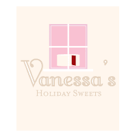
here it is!-oh, I meant to flip the word "SWEETS" on the first logo to make it read normally but forgot.

Some feedback I got in class:
*it is kind of reminiscent of Krispy Kreme's Hot Sign.
*the colors work well together
some more logos:
(do you see the "V" under the cake logo?)

& here is a repost of my first logo for Vanessa's Holiday Sweets:
feedback is always welcome, please leave criticisms &/or suggestions, thanks! :)

This is so lovely.
ReplyDeleteThe only thing that I might suggest is that the script V resembles a P in the smaller size.
Great work, I loved your sketches and to see how this developed.
I like the type for the "Vanessa's" at the very bottom of your blog post. I will say though that the color for the type does not stand out strongly compared with the background color. The color scheme will work out though, as you continue to push this design.
ReplyDeleteI do see the "V" under the cake. I also like the illustrative cake, it does looks scrumptious. :)
Have you tried giving the rolling pen a more hand drawn look? It might really suit the 'homemade' aspect of your company's products.
ReplyDeleteHi, I'm not in your class but am doing the same project so...
ReplyDeleteI like the top logos the best. Gives off a very homey feeling. I must also advise you to think about all those light pink colors. Everything's blending in together from afar.